Thursday, December 4, 2008

Optical Illusions


This great site was very informative for me. I though optical illusions or toys were new things that came into our stores not too long ago but I guess I was proven wrong. Optical illusions have been around for many years and some are quite historic. My favourite one would have to be the Chromatrope or better known as the kaleidoscope. Back when it was first invented it was large glass disks turned by a large handle in front of a "magic lantern". This gave a trippy surreal look when you looked through it. Later on the more convenient kaleidoscope was made and became pocket friendly. I never thought before looking at this sight that optical illusions were so complex or have been around for so long but the only way for you to find out is to look for yourself. CLICK HERE

Friday, November 7, 2008

Recommended Pinhole Site


The website I have been looking at is a page developed by Justin Quinnell. He is a pinhole photographer who specializes in my favorite aspect of pinhole photography. He builds cameras out of the weirdest things. He has a camera made out of a watermelon , and he also has one that goes in his mouth. I find this very interesting. Go see for your self. Clicky -------> PINHOLE PHOTOGRAPHY

Tuesday, November 4, 2008

Pinhole

Trash Wall

Hancho Pump

Forest City


On the field trip we went to Gallery 44 in downtown Toronto. We had an instructor and he helped us build and use a pinhole camera. He walked us through every step and made his points clear. After we built our cameras we were equipped with photography paper. We were let out of the building and were assigned to take a few pictures. We used the gallery's dark room and developed our photos there. After the trip we took our cameras back to school and used them for assignments there. I learned everything about pinhole cameras and, am happy I did. This excited me thinking of all the different things you could use to make cameras. Pinhole cameras work around the basis of a light-tight container with photography paper inside. There is a small hole in the container positioned in front of the blank photography paper. You set up the desired shot and slowly remove the thing that you used to block the hole. Doing this will result in slowly letting in light making your paper a picture. Developing this later in a dark room will give you a photo negative.

Monday, November 3, 2008

This particular photo uses photography lines to express it's real qualities. The diagonal lines make movement across the picture to a solid bar that gives stability a third way up the picture. This stability being a third way up also utilises the Rule of Thirds taking the focus away from the centre of the frame.
With this picture I decided to talk about the aspect of Focal Point. Your eye is un doubt ably drawn to the lock leaving the rest of the photo shadow. It really distinguishes one thing from another enhancing all of the surfaces. I also believe that this picture is very simple and easy not really going extreme with angles or dynamics. This enhances the Simplicity element as well.
This photo i took of a Scarf sitting on a pump. I digitalized it really bringing the shadow of the scarf out. This really changes the amount of texture you can see in the scarf almost giving you the image that it is there. The lines in the back use repetition and rhythm to keep your moving all across the picture therefore enhancing its elements.
This picture can be a little hard to make out. It is a photograph of a door handle. I adjusted the aperture to make the handle really stand out and the background stay as a lower element in the photo. This can be easily explained by saying I used the selective focus element. I decided to make the handle a third way across the frame making sure your eye is not in the middle. This uses the Rule of Thirds.
I took this picture whilst thinking about different camera angles. The camera was tilted as well as the objects within the frame. This makes the pylon go from the bottom to the top. If you look at the bench back rest it looks as if it is expanding as it gets closer to the camera. Shape and Form are visible there enhancing images and angles.

Wednesday, October 15, 2008

Photography

Timing the Decisive Moment

When taking a picture timing is a very large element. If it is a photo of a moving subject you want to capture it in an action where it will make the photo "exciting". An animal jumping or a human taking action can add a lot of quality to the photo. If you are taking a picture of a sport you need to take the photo when something is happening, i.e. a basket ball player dunking or a slap shot in hockey.
By: Dawson & Tylyr
http://farm3.static.flickr.com/2085/2083505315_98a94eb17e.jpg
http://www.fincalasbrisas.org/pictures%20creatures/Jesus%20Christ%20Lizard.jpg

Photography

Centre of Interest

The center of interest is the point in a photo where your eye is automatically drawn to. It is the focus of the picture and is where the photographer wants you to look. This can be reflected or presented by using objects that stand out or making a strong foreground next to an expanding background.
By: Dawson & Tylyr
http://www.dcmag.co.uk/fx/4a512627/countryside.img?iwidth=651
http://farm2.static.flickr.com/1051/574379846_e79e059d3c.jpg

Tuesday, October 14, 2008


Fashon really originates in Europe, according to photography veteran Steven Silverstein. This article I am viewing is about a retired photographer who took a trip to france to teach students at Brook university about model photography. By model photography I mean editorial fashion photography. He equipped students with Nikon D3 cameras and helped them learn alot more about the fashion industry's photography.


This article I believe is informative and useful. It describes the program thoroughly and goes in-depth to give the reader the sense that they're involved. The program involved 28 young photographers who had their cameras with them all the time "day and night". The main idea for Silverstein's program was not for commercial reasons, although the photos were professional quality the nature of this program was education. The goal for this project was to give students a glimpse of what it is to be an editorial fashion photographer.

The article was quick and to the point. It had many different topics thoroughly discussed and i believe is very relevant to the assigned task. http://www.pdnonline.com/pdn/content_display/pdnedu/student-news-and-views/e3i6f1a24d20528a547e3e739b0f25e1b18

I am making this post so that I can talk about a valuable graphic design site that I find unique on the internet. The site Star Graphic Design is a site that has many different pictures made by the owners using all of the properties of design well. It has free backgrounds, screen savers and gives examples of proper graphic designs using 3demensions. Check it out for yourself at http://www.stargraphicdesign.com/.


My design company is called Naff Graphics. We are an independent company that does private contracts for small to large businesses. The gecko is a small witty animal that perfectly describes our company.

I used similar colours to give an easy casual feeling. The lines that I used are concrete and to the point. It devises the colours accordingly to make it easier on the eye. My black and white solution is extremely contrasting and the division in the lines makes the contrast more effective.

My logo in my opinion describes my company well and I think it utilises the principals of design properly.


Wednesday, October 1, 2008


Our teacher assigned us to do a drawing of a chess piece using value and movement in the background. I decided to draw a rook. After many drafts and rough copies I finally chose the position I wanted to draw it in. The background took a lot of effort to come up with. I had many different choices to pick from with this project. I started by drawing the top of the chess piece and working on making my way down the chess piece until it ran off the page. I drew this with the "growing drawing " technique. This requires you to draw each part with detail then move on to the next. After I finished drawing the actual chess piece I began to draw the background. I feel my background gives the feeling that you are being sucked into my drawing. The curvy lines give a kind of lazed pull into the top corner of the paper. I think i acquired the needed criteria for this assignment.

Thursday, September 18, 2008

I and the Village by Mark Chagall

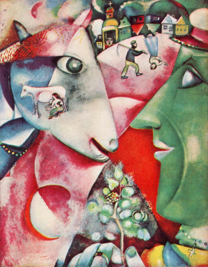
I have decided to talk about and share my opinion about the painting " I and the Village" by Marc Chagall. Marc Chagall is a French painter. I and the Village, was inspired by two sources. The Jewish life and folklore of his Russian childhood, along with the bible.

This painting can be described with a wide variety of adjectives. In many ways this painting is imitational and non- imitational, there are many real qualities to this painting. I find that that the foreground is a little more realistic than the background. The stroke style in my opinion gives a very surreal feeling and makes the painting a lot more hectic. You can definitly point out that there are houses in the background, but some of them are upside-down. Not one point or spot of this painting is not filled with lots of colour. This gives a very shocking feeling to the painting.

Emotionilism for this painting is it's strongest quality. The painting's colours and wide variety of surreal people, animals, and houses give it a very confusing feeling. It's one of those paintinting that make you say, "Whoa, what is that?". The foreground (even though it is a green man feeding a pink- purple goat) is more realistic than the background. Both of them combined make an extremely perplexing painting which can only be described as extrodinary for the emotions. The grapes in the middle of the painting do an accurate job on balancing out the painting and make both sides "weight the same".

Marc Chagall does an exceptional job on making the painting as formal as possible. He uses lines and colours to really express and utilise the principles and elements of design.

In conclusion Marc Chagall did a very superb job on this painting to "express" all of the emotional, imitational, and formal qualities of any piece of art.

Wednesday, September 17, 2008

coming up

im gonna be researching the painting i and the village. Im gonna post the painting and my thoughts and views about it. i hope your as excited as i am.

WOW

This page is about me and how great i am. I'm gonna post art and various toics from my class.
I am the greatest.